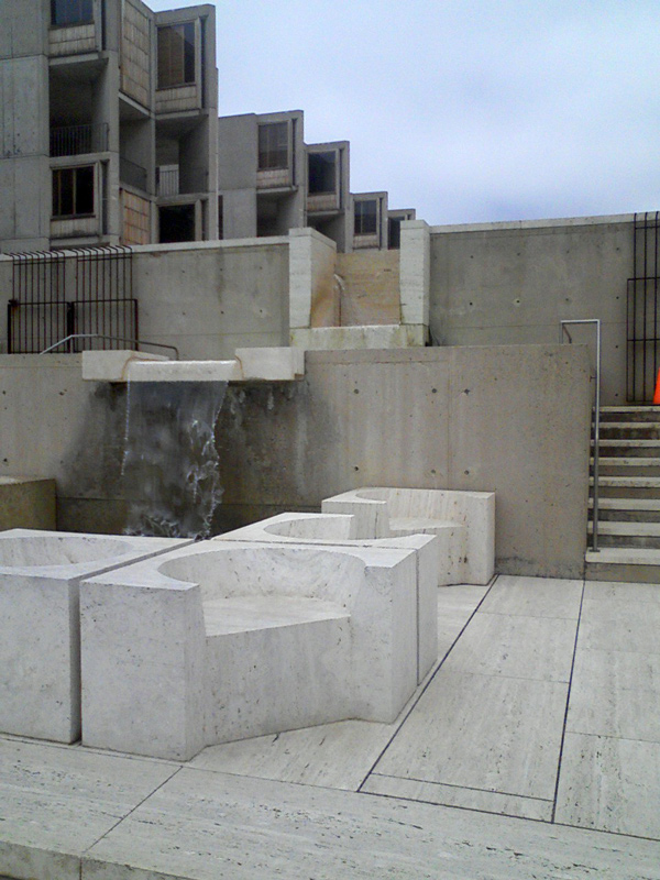
architecture: Louis Kahn's Salk Institute: absence of grandeur yet completely inspiring
Architectural tourism is somewhat clichéd, “You simply must visit Bilbao to see the Guggenheim” Nevertheless it is the reason to see Chicago, and reading a trip to Philip Johnson's Glass House (actually a 47-acre site full of buildings by the near-master) made my mouth water. So on a road trip to La Jolla I remembered the Salk Institute by mid-century modernist Louis Kahn, and we wandered around for 35 minutes.
Here's the iconic plaza (click each image to see larger)

I cropped it off-center so you can see the primitive offices, made out of teak wood and slatted windows. They feel more like a kitchen window in a beach house, but that's what was available in 1960. Kahn said of his design "Materials used are concrete, wood, marble and water."
The stream drops down a level to a pool, revealing more of the Pacific coast landscape
It's just geometric form, but the tranquil perfection fills your heart.
The pool flows down another level
 Looking back, you see the offices in those solid towers oriented towards the Pacific. And people were sitting on those beautiful Platonic forms.
 The towers you see on the plaza are for professors' offices, they are flanked by towers for laboratories and utilities, (read more at the Salk site.) Since the plaza is high up, the towers actually extend several floors below it to form these lovely cloisters. Much of the new architecture at Oxford University tries to achieve this feel, but doesn't have this amazing topography.
The institute has grown, so further inland from that intitial fountain, Anshen + Allen (who worked with Kahn) designed an additional building to the east split by a symmetrical path up to the plaza. Here's one side of it.

It's good, it uses the same forms with the same lowered courtyards, and can use "modern" glass and cladding, but it lacks the gentle heft of the original.
The institute was on the World Monuments Fund 2008 list of the 100 most endangered sites because of a planned 240,000 square foot expansion, plopping a daycare center in that iconic view of the Pacific, but it seems the institute has come up with a more acceptable plan.
Here's the iconic plaza (click each image to see larger)

I cropped it off-center so you can see the primitive offices, made out of teak wood and slatted windows. They feel more like a kitchen window in a beach house, but that's what was available in 1960. Kahn said of his design "Materials used are concrete, wood, marble and water."
The stream drops down a level to a pool, revealing more of the Pacific coast landscape

It's just geometric form, but the tranquil perfection fills your heart.
The pool flows down another level
 Looking back, you see the offices in those solid towers oriented towards the Pacific. And people were sitting on those beautiful Platonic forms.
 The towers you see on the plaza are for professors' offices, they are flanked by towers for laboratories and utilities, (read more at the Salk site.) Since the plaza is high up, the towers actually extend several floors below it to form these lovely cloisters. Much of the new architecture at Oxford University tries to achieve this feel, but doesn't have this amazing topography.
The institute has grown, so further inland from that intitial fountain, Anshen + Allen (who worked with Kahn) designed an additional building to the east split by a symmetrical path up to the plaza. Here's one side of it.

It's good, it uses the same forms with the same lowered courtyards, and can use "modern" glass and cladding, but it lacks the gentle heft of the original.
The institute was on the World Monuments Fund 2008 list of the 100 most endangered sites because of a planned 240,000 square foot expansion, plopping a daycare center in that iconic view of the Pacific, but it seems the institute has come up with a more acceptable plan.
Labels: architecture


0 Comments:
Post a Comment
Links to this post:
Create a Link
<< Home