Wuff

Friday, December 29, 2006

charity: a whale of a tax deduction

I was trying to figure out whether the raffle tickets, auctions, and dinners we attended "for charity" are in fact tax-deductible. Here's what the IRS says:

Expenses of Whaling Captains

Beginning in 2005, you may be able to deduct as a charitable contribution the reasonable and necessary whaling expenses paid during the year in carrying out sanctioned whaling activities. The deduction is limited to $10,000 a year.
To claim the deduction, you must be recognized by the Alaska Eskimo Whaling Commission as a whaling captain charged with the responsibility of maintaining and carrying out sanctioned whaling activities
Damn Captain Ahab always getting a break from the feds!

The IRS actually does a good job of saying, basically, "No". Since I got something in exchange, the quid pro quo means it's not deductible. Unless I can prove that the raffle prizes/auction stuff/dinner food was only worth $three-fiddy (South Park). So many people must cheat at this on their taxes—the check is made out to a charitable cause, so it must be deductible.

Categories: ,

Labels: ,

Tuesday, December 26, 2006

web: huge lameosity at Yahoo TV listings

broken Yahoo TV listings
I used to go to tv.yahoo.com/grid/ to see what's on TV. Yahoo "upgraded" to a new interface at tv.yahoo.com/listings and it can't even get the time right. I've told tv.yahoo my TV provider is "San Francisco-Oak-San Jose", so why the hell are they showing Eastern Standard Time? I've even told Yahoo my timezone on my Yahoo ID Card. Judging from the screaming and yelling on this Yahoo blog, they've had this bug for five weeks, which is beyond inexcusable (the tracker on Yahoo's suggestion board claims this is resolved?!)

Google, please take on Yahoo and punish them for this incompetence. tv.google.com is currently a 404; I'm trying various TV listing gadgets for my Google home page, without much luck.

Categories: ,

Labels: ,

Tuesday, December 19, 2006

music: pick jaw off floor at Joanna Newsom concert

So after listening to Ys all day we went to the concert. She was jaw-droppingly good, concert of the decade for me (not that we see many concerts). I've never ever seen an artist throw herself into a performance so completely. Just like the New Yorker review said, "Without seeing Newsom’s hands and feet, it is difficult to understand how hard she must work to pluck the strings and press the pedals while reciting by heart a small book’s worth of verse. I haven’t seen a performance of such sustained intensity all year."

She performed some solo songs off "Milk-Eyed Mender", and all of "Ys" but with a weird band (accordion, tambura, saw, glockenspiel, banjo, ...) rather than orchestra. The shrieks and cracks in her recorded vocals are obviously intentional because they were largely absent live. Watching her pour everything into her singing and playing was transporting. The reorchestrations for her band were great, the harp and strings sound from the record spread around the musicians like quadrophonics.

Joanna, please please please please please please release a concert DVD!
"And I miss your precious heart" (Cosmia)

Categories: ,

Labels: ,

music: Joanna Newsom Ys good

As I wrote in my Amazon review of "The Milk-Eyed Mender", it's pretty straightforward: Play the Sprout and the Bean video four times in two days, and you'll know if you can get past the vocals. She does sound like Bjork's niece going nuts in detention.

I've been listening to her ambitious follow-up "Ys" all day prior to the concert. The lyrics are fantastic. The music varies, tracks 1/3/5 are standouts; it does meander over the course of the long songs. If anything the orchestrations by Van Dyke Parks (who most recently worked on Brian Wilson's "Smile") are more of an acquired taste than her voice, but they highlight the lyrics and music. She's got a strong command of her instrument in service of her songs, but she's not a harp virtuoso (I saw classical harpist Dan Yu perform, and she's about three times faster than Joanna Newsom).

It's not as balanced as "Milk-Eyed Mender" because the lyrics overpower the rest, but what lyrics. They move from precise natural descriptions (of skipping stones, puppets, meteors, ...) to talismanic phrases of birds and water, to epic adventures.
And, Emily - I saw you last night by the river
I dreamed you were skipping little stones across the surface of the water
Frowning at the angle where they were lost, and slipped under forever,
In a mud-cloud, mica-spangled, like the sky'd been breathing on a mirror


Categories: ,

Labels: ,

Wednesday, December 13, 2006

house: it's taps for me

Chicago Faucet wrist blade handlesPerfection has been achieved in faucet handle ergonomics: the Chicago Faucet blade-style taps that you see in hospitals and bathrooms for the disabled improved accessibility. But they aren't especially modern.


Dornbracht Tara tapsI knew of Dornbracht , their contemporary classic is the Tara line with cross-shaped handles. But the cross shape looks uncomfortable and is unreadable — you can't tell if the faucet is on or off. They look good even when the taps aren't aligned perfectly, but that benefits plumbers, not owners.


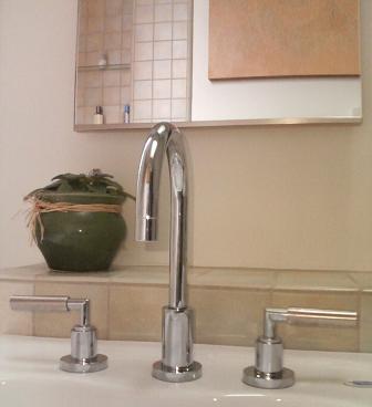
Then I found Dornbracht's Tara Classic, also from Sieger Design but with a single handle. It has some of the ergonomic benefits of a blade handle (you can turn them on and off with your wrists) and a beautiful design. The pulls in the house are satin stainless, but for plumbing we went with chrome because the matching accessories are only available in chrome. Dornbracht has a "platinum matt" finish for handles that is irresistably beautiful even though it doesn't match any other finish in the house. Here they are.
Dornbracht Tara Classic w/ platinum matt handles on Toto Supreme sink
(The sink or "lavatory" as builders call it is a Toto Supreme wall mount with SanaGloss, a glaze that really works to reduce build-up and make cleaning easy. We have a pair of them side-by-side.)

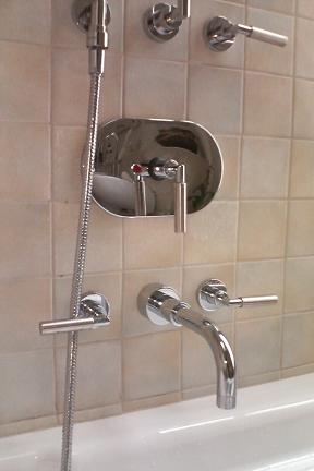
The bathtub has a nest of Tara Classic fittings. (It's a Toto six-foot bathtub, alas not available with SanaGloss.)
Dornbracht Tara Classic w/ platinum matt handles on Toto bathtub

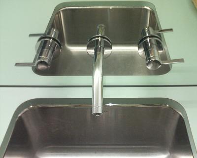
In our downstairs guest bathroom Tara Classic wouldn't work as well because the taps are mounted in a mirror, also that floor has a less refined feel. We chose Kohler Stillness instead. The design is OK but lacks the clarity and tactile pleasure of the Tara Classic. You can tell the look of Stillness came first.Kohler Stillness taps in mirror

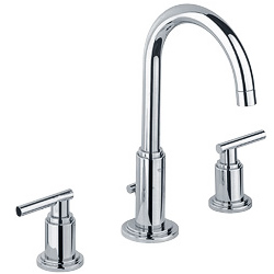
Grohe Atria fussy faucet designThe Tara Classic is such an obvious design, yet nobody else has come close to it aesthetically. This Grohe Atria is similar but way too fussy, its handle pokes out the other side for no good reason. Delta makes a crazy tap unit with similar handles that looks like a V-twin engine. Dornbracht taps cost hundreds of dollars each, yet the Chinese aren't making cheap knockoffs of them, they're making copies of ugly boring designs.


Categories: ,

Labels: ,

house: front façade fixing

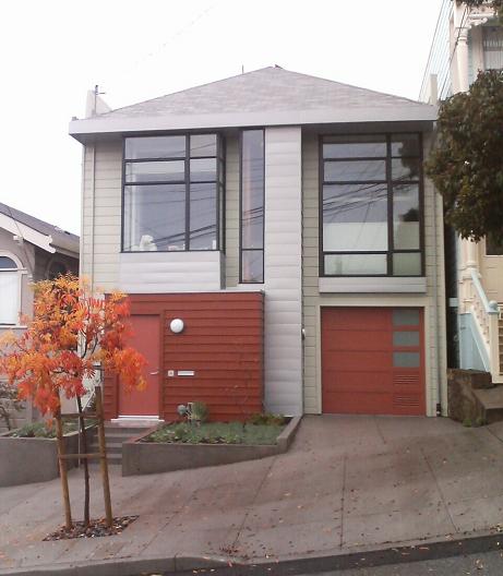
new house facade
This was a monstrous remodel to make a modern house.

Here's what it looked like before:
old house facade
Nothing much changed, it's still recognizably a two-story Edwardian with bedroom and office bay windows flanking an odd central "nose", with an entry way and garage below. It's still got wood siding and a hipped (i.e. tilted backwards, unlike a Victorian gable) composite roof. No wonder nobody complained during the permit review. But in fact everything changed:
  • new roof (the old one wasn't strong enough to cope with removing all the rafters and interior walls)
  • rebuilt entry "box"
  • moved garage opening
  • steel framing
  • parapets required for fire code
The house façade had interest, but if you look carefully, it sucked. Nothing lined up:
  • the left bay window hung over the side of the entry box
  • the right bay window was misaligned with the garage
  • the bay windows were different sizes
  • The center front staircase wasn't centered! Furthermore, the pointy stained glass and pointy roof were arrows shouting out "Hey, I'm over a foot off-center to the right"
Some of this is easy to fix, it just rip out and rebuild. But the last was hard, hard, hard to solve. Early in the design we moved the stairs back to the middle of the house, so we had some flexibility. But something had to go between the windows and we wanted to keep light in the front. Our architects Markoff-Fullerton came up with dozens of sketches organizing the four boxes (two windows, entry box, and garage) around the front, they tried extending planes from them like a Peter Eisenman construction, tried making the entry box and nose into a giant 'd' shape. Nothing quite worked. Then they came up with the idea of splitting the nose into partly glass and partly solid. The line between them is perfectly centered.

Unlike a usual McMansion remodel, our architects shrank the front: with the stairs moved to the inside of the house, the nose could shrink, and they pulled the right window back. The solution of the center problem and the stacking of the front four boxes around the nose to form planes of varying depths is a work of complete sustained artistry. Building a modern house from scratch in the middle of nowhere would be far simpler. Yet you'd never know to look at the house how much design effort went into it; our neighbors just like or love the house without really knowing why.

Other notes:
  • The material in the nose and below the windows is Rheinzink, a more environmentally benign material than galvanized zinc.
  • Building codes required lots of ventilation in the garage. Some day we'll swap out one of the vents for another translucent panel and the front will look even better.
  • The entry box was supposed to have a semi-solid golden stain, but it came out darker and then needed a second coat.
  • Elliot Goliger of Artisans Landscape did the front planters.
  • The street tree is a Chinese Pistache (first they made our toys, then our electronics, and now our trees...).
  • I blogged more on the front entry hardware.


,

Labels: ,

house: front detailing

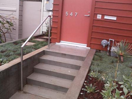
California Contract Co. handrail, Schlage L lock, Obline house numbers, Doorbell Fon, and mail slot
Handles meet up with accessories on the house front.

Note how the house numbers, door handle, doorbell, and generic mail slot are in a perfect line. Bruce Fullerton of Markoff-Fullerton really worked on the horizontal spacing, splaying the numbers across the door in a modestly strong way. I chose the house number font (Obline regular from customhousenumbers.com); unlike most modern fonts the '5' is upright and the '7' has a lovely subtle curve. The California Contract Co. hand rail, house numbers, and Schlage L mortise lock are all in satin stainless steel, but then the Door Fon and the mail slot are in brushed aluminum. If I had the money the finishes would all be identical; I'd also get the ugly gas connection and electrical meters hidden by any means necessary. Mies van der Rohe said "God is in the details", but God had time and money to burn.

, ,

Labels: , ,

house: love handles

With few interior walls and little decorative trim in a modern house, the pulls (what architects and builders call "handles") really stand out.
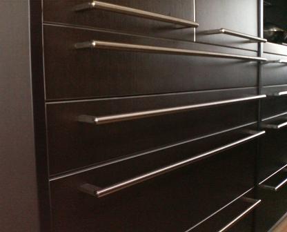
bulthaup handles
The bulthaup kitchen handles are a given. I don't like the logo they etch on the side, but it would have been crazy to replace them all. (For their new b3 line bulthaup changed the handles, making the supports chunkier.) Note the handles line up nearly perfectly. Dawson+Clinton installed the kitchen.
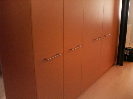
bulthaup handles
So we used the same handles on the facing 7-foot tall pantry doors from Cabinet Solutions.
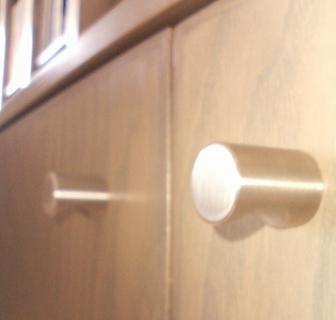
Omnia cylinder finger pulls
Here are the pulls on the stained ash living room cabinets. This is my favorite piece of hardware: a cylindrical finger pull with a cylindrical cut-out for your finger. Pure perfection of Platonic form. Everyone makes them. The trick is finishing the edge so they aren't too sharp. I think we used Omnia hardware in brushed stainless steel.
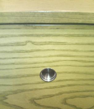
Sugatsune flush pull in cabinet sliding door
For sliding doors in the cabinets, we used Sugatsune recessed pulls. They match the round theme, but somehow don't grab me as much.
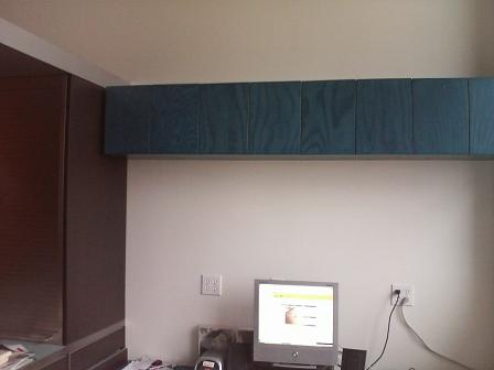
office cupboards with touch latches
Sometimes the best handle is none at all. That's the office space where I'm typing this, another great set of stained ash cabinets from Cabinet Solutions with touch latches on the doors. On the left is the black oak "back" of the bulthaup kitchen, which also has touch latches on its drawers. (You can see the desk interferes with one of the drawers, but some day I'll figure out how to make it a height-adjustable sit-stand desk.)
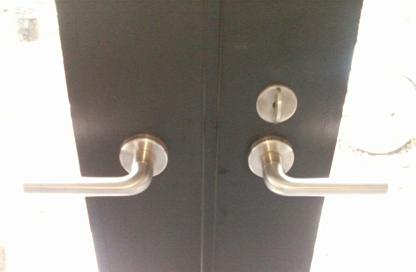
Schlage L handles on Bonelli doors
Here are the door handles on the Bonelli french doors into the garden. The architects specified Schlage L series extra-heavy duty commercial mortise locks. We chose the 02 rounded corner handle in 630 Satin Stainless Steel. They feel great and don't have that extra hook on the handle that would make them look institutional, or the wacky expressiveness of Italian handles. They're expensive compared with Omnia but cheap compared with European locks like FSB.
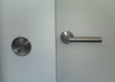
Sugatsune flush pull and Schlage L lock
We used bigger Sugatsune recessed pulls on sliding doors. The finish almost but not quite matches the Schlage handles (you are in a maze of nickel satin silver, satin stainless, brushed stainless, ...). It would have been perfect if the Sugatsune depression was the exact same size as the collar on the handle; or maybe not, since you grab one and don't touch the other. Beauty, orderliness, utility, simplicity — there's perfection in there somewhere.
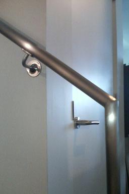
California Contract Co. handrail and Schlage L lock
A local fabricator, Michael Stang of California Contract Co., made the handrails for the stairs. They came out really nicely, as they should for thousands of dollars. It would have been so great if the bend radius of the support matched the door handles and the wall plate matched the lock collar!

See also sink handles.

Categories: ,

Labels: ,